
Dashboard
The dashboard provides a real-time overview of your platform’s reliability. It brings together active incidents, historical incident activity, overall health, latency, and availability in a single view.
Use the dashboard to quickly understand the current state of your platform and identify areas that require attention.
A hierarchy of attention
Section titled “A hierarchy of attention”xrelia follows a simple UI philosophy: the higher something appears on the screen, the more important or urgent it is. The most critical information, active incidents, service health, and issues requiring immediate attention, is placed at the top, where it can be seen first during a quick scan. As you move down the page, information becomes progressively less urgent and more contextual, helping users move naturally from “What needs my attention now?” to “Why is it happening?” and finally “What else should I know?” This hierarchy allows engineers to understand the state of their platform at a glance without having to search through dashboards to find what matters.
Incident summary and health cards
Section titled “Incident summary and health cards”The summary cards at the top of the dashboard provide an immediate view of incident activity.

Active incidents
Section titled “Active incidents”Shows the number of incidents currently affecting your platform.
The number below the count indicates how many services are currently affected by these incidents.
Decaying incidents
Section titled “Decaying incidents”Shows incidents that are no longer actively worsening and are moving toward recovery.
This can help distinguish ongoing problems from incidents whose impact is decreasing.
24-hr incidents
Section titled “24-hr incidents”Shows the number of incidents detected during the last 24 hours and the number of services affected by them.
72-hr incidents
Section titled “72-hr incidents”Shows the number of incidents detected during the last 72 hours and the number of services affected.
Together, these incident indicators provide a quick view of both current and recent reliability activity.
Health cards
Section titled “Health cards”The health cards show the overall health of the platform across different time windows.
xrelia currently provides:
- 5-min health - short-term platform health
- 1-hr health - recent platform health over the last hour
- 24-hr health - longer-term platform health over the last 24 hours
Each health card displays a health state and its corresponding health score.
A score provides a numeric representation of platform health, while the health state makes the result easier to interpret at a glance.
Overall health
Section titled “Overall health”The 1-hr overall health chart shows how the platform’s health has evolved during the selected time period.
The chart can display:
- Health - overall health score
- Critical impact - impact associated with critical incidents
- Major impact - impact associated with major incidents
- Minor impact - impact associated with minor incidents
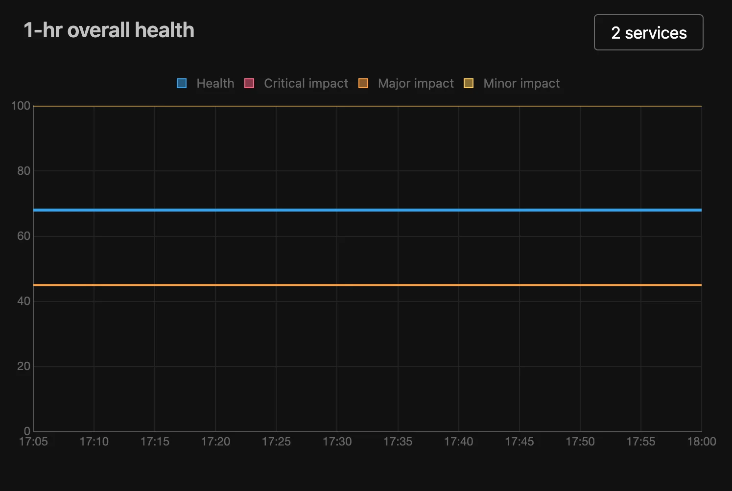
Use this chart to understand whether platform health is stable, improving, or deteriorating and how incidents are contributing to the overall health picture.
The service count displayed above the chart indicates how many services are included in the current health calculation.
Latency
Section titled “Latency”The dashboard provides latency charts for the P50, P90, and P99 percentiles for each service.
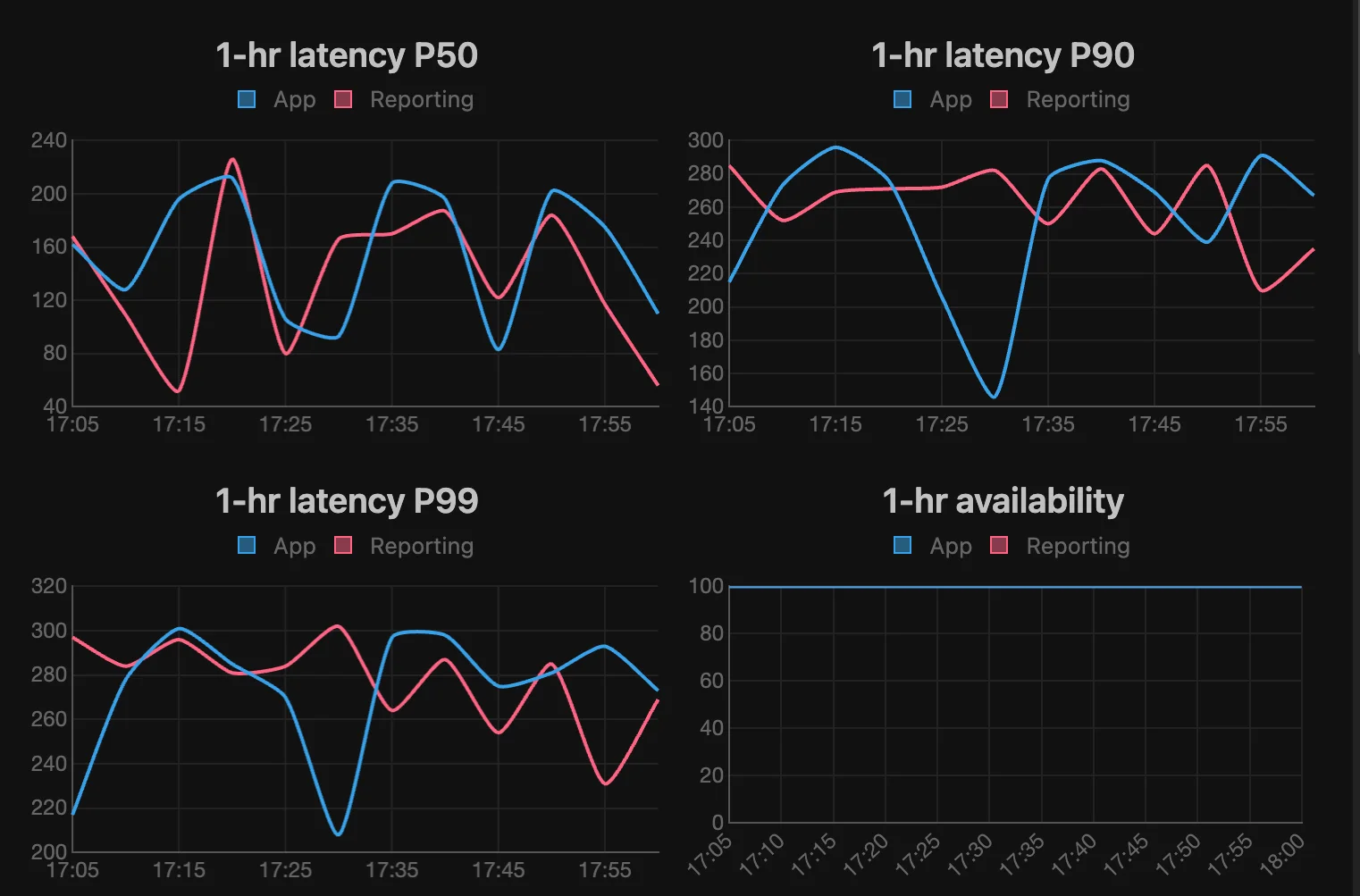
xrelia allows you to choose which monitoring source is used to calculate latency:
- Health checks - latency measured by service health checks.
- User journeys - latency measured by synthetic requests that simulate real user interactions or application workflows.
This allows you to view latency from either a service-level perspective or from the perspective of actual application workflows.
P50 represents the median latency. Half of the measured requests complete faster than this value and half take longer.
P90 represents the latency below which 90% of requests complete. It provides a better view of slower requests than the median.
P99 represents the latency below which 99% of requests complete. It is particularly useful for identifying high-latency outliers that may affect a smaller portion of users.
Latency charts can show data for individual services, allowing you to compare their performance over time.
Availability
Section titled “Availability”The 1-hr availability chart shows the availability of the services included in the current view.
Availability is expressed as a percentage, making it easy to identify periods where a service experienced failures or degraded availability.
Use availability together with latency and health information to distinguish between a service that is unavailable and one that is available but performing poorly.
Reading the Dashboard
Section titled “Reading the Dashboard”The dashboard is designed to support a simple workflow:
- Check the incident summary to see whether anything is currently affecting the platform.
- Check the health cards to understand the current and recent reliability state.
- Review overall health to see how platform health has changed over time.
- Inspect latency to identify performance degradation and high-latency outliers.
- Check availability to determine whether services are experiencing failures.
This combination gives you a unified view of platform reliability without requiring you to inspect individual monitoring signals separately.